Branding

Guidelines

Welcome to our branding page! We have placed our branding assets here for use in digital and print publication and promotional and social media posts. We want to make it easy for you to integrate our branding for your project while respecting our brand and legal restrictions.

Please note: by using our resources, you accept our Terms of Service and usage of these resources may also be covered by our Privacy Policy. Use of our branding must fall within our branding guidelines. This mean, our logo, sub mark, typography, colors, patterns, etc., should be maintained to ensure brand identity. Use of our branding does not constitute ownership by user; Less Than retains the rights to all of our intellectual property. Using our branding for monetary gain is prohibited without prior written approval. Whenever in doubt, please seek approval.


Our Logo

We are very proud of our logo, and we require that you follow these guidelines to ensure it always looks its best. Our logo is the combination of a simple and modern wordmark and icon.

Do’s: choose from our colors, resize, place on white background.
Don’t: deviate from typeface, deviate from brand colors, alter logo.

Our Submark

You can use our sub marks where you think our logo is too wide. Use of our sub mark should always be secondary; please use our main logo whenever possible.


Do’s: choose from our colors, resize, place on white background.
Don’t: deviate from icon, deviate from brand colors, alter shape.

Our Typography

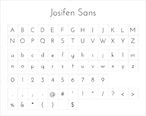
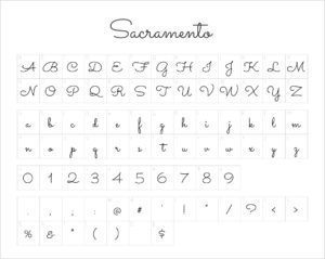
We utilize two font families for our brand: Josefin Sans and Sacramento. You may download each from the link below. Our branding uses Sacramento sparingly, mostly for our main logo. Joseifin Sans should be used for reading text. We discourage the use of Sacramento for words or phrases beyond 8 characters.

Do’s: choose from our fonts, default to Josefin Sans.
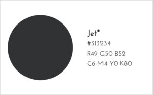
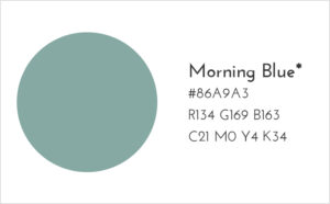
Don’t: deviate from fonts, deviate from brand colors with the exception of black and white, rely on Sacramento heavily.

Our Colors

We have done a lot of research to give meaningful beauty to our brand and have chosen the colors below. While using our assets, keep in mind to use only colors from below with the exception of black [#000000] and white [#ffffff] where needed.

Our Pattern

We created a pattern for our brand which captures fluidity and nature. A transparent pattern is attached.

Do’s: use pattern against white background, resize pattern, incorporate other branding elements.
Don’t: alter pattern, use non-brand elements, use a single color for all shapes.

Branding Do’s

Branding Don’ts

Thank you so much for including Less Than in your work! If you are having trouble with this guide, are missing brand elements, are unsure if your communication best represents Less Than, or are seeking use permission, please contact us at hello@golessthan.com

Shopping Cart